Livius Dietzel and Tom Hoßfeld originally designed the typeface that would become Graphit for their own projects as a single-weight font named after their studio, Lit.
It’s not surprising that Hannes von Döhren encouraged them to develop the design into a full family for commercial release. Döhren has often shown the ability to combine various influences while designing typefaces that are both restrained and original, with an uncommon internal cohesive quality (see Basic Gothic and Niveau Grotesk).
Building on this cohesive quality, Graphit manages to convey a distinct voice by using elements from apparently contrasting sources. It’s hard to say if the recurring angular theme comes from G or Q. The first is a form that has illustrious historical precedents in sparse examples of Italian futurist lettering from the 1930s. This is clearly attuned to the overall vocation of the alphabet, which positions itself as part of the revisitation of the coeval geometric-humanistic types.
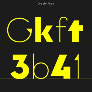
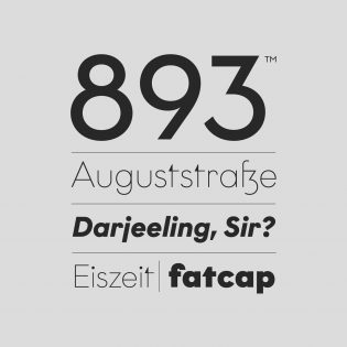
But Graphit succeeds in going beyond a slavish imitation of its most famous precursors. Its character comes together when Dietzel and Hoßfeld integrate geometry with crafted solutions steeped in an industrial-era flavor; this particularly stands out in letters like the hallmark k, in f and r, and in the orthogonally cut-off curved strokes of c, e, and s. The uncompromising choice of t effects an integration of all of the influences, which contributes in bringing the design logic to an extreme when the triangular shapes are turned into an eye-catching element in the two lighter weights of the family.
All in all, Graphit manages to communicate a sense of contemporaneity that doesn’t deviate much from more notable and consolidated geohumanist models. A stronger optical correction of the triangular elements and at stem-junction level maybe could have improved the typeface’s usability in extended text settings, but that would have made it less distinct at large sizes. Optical masters for small text sizes could be a great addition to the family.



Hermosa tiporafia
Beautiful, love it.