
There’s a quote, perhaps apocryphal, from Massimo Vignelli that you’ll sometimes hear from alumni of Cranbrook Academy of Art’s design department. “Cranbrook”, he supposedly said, sometime in the ’80s or ’90s, “is the most dangerous design school in America.” They recite this like a badge of honor, though no one I spoke with is quite sure when or where he said it. It might have been in an interview or on stage at a design conference. Maybe it was just in conversation with a friend. But does it matter? Even if he never said it, the sentiment was (is?) shared by flocks in the design profession. The myth and mystique around Cranbrook is prone to strong emotions and bold statements. You either love it or you hate it. In 1984, for example, Paul Goldberger, the then-architecture critic of The New York Times wrote that “Cranbrook, more than any other institution, has the right to think of itself as synonymous with contemporary American Design.” And an article in Eye noted how the design department had been accused of “hermeticism, formalism, theoretical obfuscation and other crimes against the values of both classic Modernism.” I want to add my own hyperbole to the list: For the last 50 years, the students at Cranbrook have continually produced some of the most interesting, unusual, and theoretically rigorous graphic design anywhere in the world.
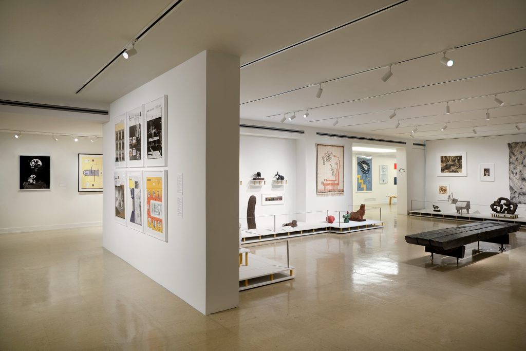
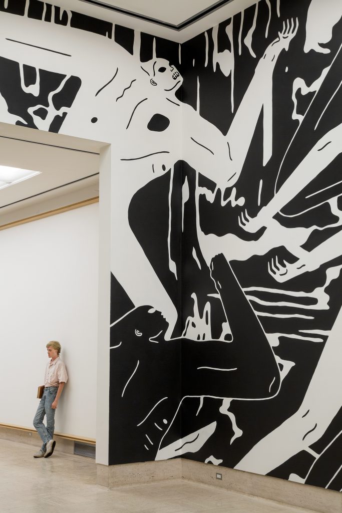
Some of this work can be seen—alongside work from the school’s other departments across art and design ranging from architecture to product design, painting to fibers, sculpture to printmaking—in the appropriately bold With Eyes Open, a massive exhibition (and 624 page book) of work from past and current students and faculty, curated by Andrew Blauvelt and currently on view at the Cranbrook Art Museum. Blauvelt, the museum’s director and a former student of the famed, or infamous, design department, spent the last four years in the school’s archives, looking at work from students, faculty, and friends to help tell the story of how this small graduate school in a suburb of Detroit has always been ground zero for innovation in art, architecture, and perhaps especially, graphic design.
Cranbrook was founded in 1904 as family country estate of Michigan newspaper magnate George Gough Booth and his wife Ellen. The couple had purchased large tracts of land in Bloomfield Hills with the hope of turning it into an experimental arts colony modeled on the American Academy in Rome and hired Finnish architect Eliel Saarinen to design a master plan, slowly turning their property into a series of schools, museums, and the Academy of Art, which opened in 1932. Saarinen, who also developed the curriculum and served as its first president, immediately made architecture a central part of this new institution. Like other architects of the era, he took an expansive view of what the architect could do, not simply interested in buildings but in the design of everything from products to city plans to graphics.
Graphic design’s history in the academy is hard to trace, but it was clearly there at the outset. “From the beginning, there was an emphasis on printmaking and book binding because of Gough’s work in newspapers,” Blauvelt told me. “We used to have a bookmaker in residence on campus.” While graphic design did not yet have its own department, Saarinen’s daughter, Pipsan, an interior designer, taught the basics inside the school’s more general “design” department. For the first few decades, the design department cycled through directors quickly. Most notable was Charles Eames, who studied under Eleil in the architecture department before running the design department in the late ’30s. The alumni of this era reads like a superteam of mid-century modern designers: Ray Eames, Eero Saarinen (Eliel’s son), Harry Bertoia, Florence Knoll, and Gere Kavanaugh. Because of the Eames’s connections, the design department’s early focus was on furniture, product, and interior design, maintaining a strong connection to Michigan-based furniture company Herman Miller (Stephen Frykholm, who graduated from Cranbrook in 1969, was the company’s first graphic designer).
Saarinen described the Cranbrook model as “self education under good leadership,” where students and instructors would learn together, without hierarchy.
Cranbrook was founded in the era of experimental art education—Black Mountain College in North Carolina, was also founded in 1933, and the Bauhaus in Germany just a few years earlier in 1919. Saarinen described the Cranbrook model as “self education under good leadership,” where students and instructors would learn together, without hierarchy. The curriculum is built on a studio model where there are no classes or faculty, projects or grades. Rather, students would develop their own projects, following their interests and curiosities, under the guidance of an “artist in residence” who would maintain their own creative practice alongside advising students and leading the department. This allowed for students to build truly trans-disciplinary practices that often jumped between departments and experimented with form, material, or process.
Graphic design became a more pronounced area of study at Cranbrook with the arrival of Katherine and Michael McCoy in 1971. The husband-and-wife team came from industrial design backgrounds, but Katherine had cut her teeth at Unimark, the international design consultancy known for spreading American modernism (and co-founded by Vignelli). They created two tracks—product design (led by Michael) and graphic design (led by Katherine)—though, in Cranbrook fashion, allowed ample fluidity between the tracks. “We are a newly reorganized community of twenty designers in the various environmental disciplines concerned with hardware solutions to human needs,” they wrote in a poster announcing the formation of the reformatted design department.
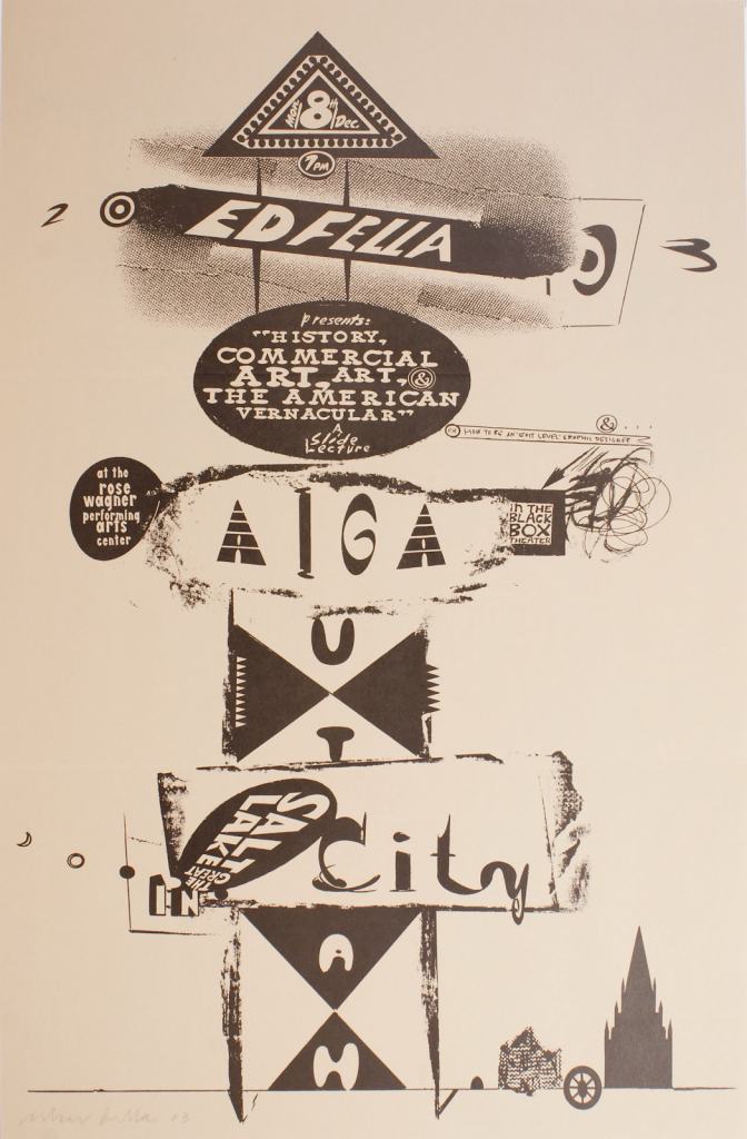
Under the McCoys leadership, the Design Department was the only department to break from the no-projects Cranbrook model. “When I was there, we were doing three types of work simultaneously,” Blauvelt told me. “We had assignments that Kathy would assign, we were required to do freelance work for real clients, and then we had independent, self-initiated work like the rest of the school. I think the McCoys’ special sauce was the combination of those three things.” Under Katherine’s leadership, the Cranbrook graphic design department became internationally known, and its influence still ripples across the design landscape, as their students graduated and continued to teach, furthering the Cranbrook philosophy. Design educators like Lorraine Wild, Jeffery Keedy, Ed Fella, Lucille Tenazes, Martin Venezky, Tom Wedell, and Nancy Skolos studied under the McCoys and would go on to produce work across scales and contexts while teaching at design programs around the country.

“In the 1970s and 1980s, Cranbrook, like most art programs, was grappling with the larger cultural questions posed by the ascendance of postmodernism and its reassessment of the legacy of the modern project,” writes Blauvelt in With Eyes Open. Around the same time the McCoys arrived, Daniel Libeskind, long before he became a starchitect, was appointed designer-in-residence for the architecture department. “He was considered a ‘paper architect,’ working in speculative modes and mostly known for his writing and drawings. He was incredibly well-read and became influential across the academy,” Blauvelt says. Libeskind’s interest in meaning—not simply form and technical skills— spread across the school as he brought in theorists, writers, and critics to speak to students. “Libeskind helped the design department when they were asked to design an issue of Visible Language on structuralism and post-structuralism,” Blauvelt continues. “After that, those theories began to take hold.”
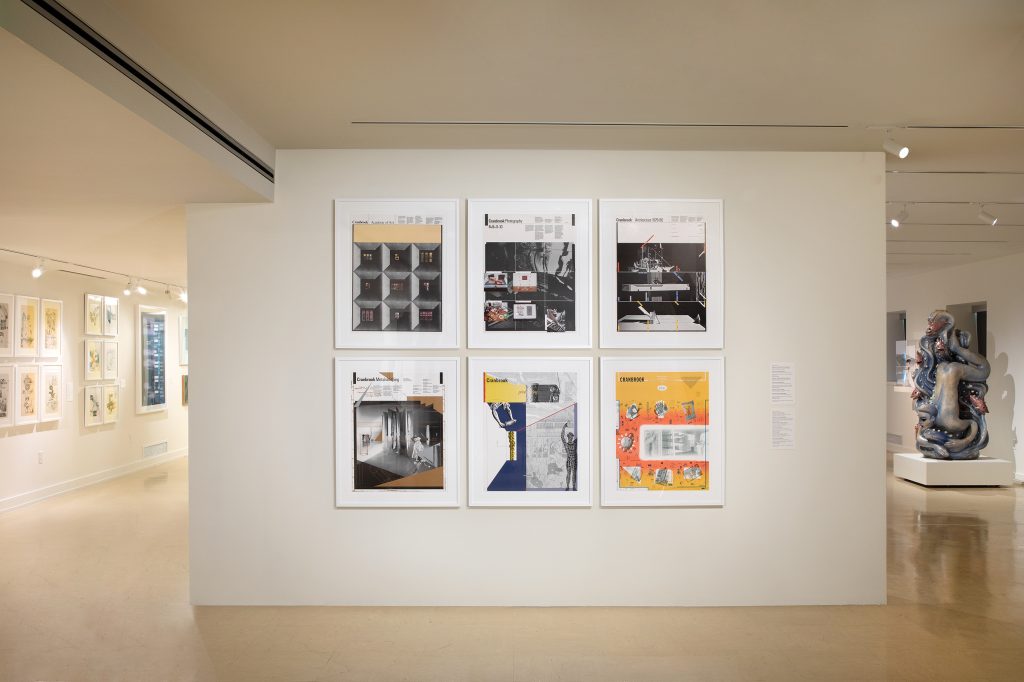
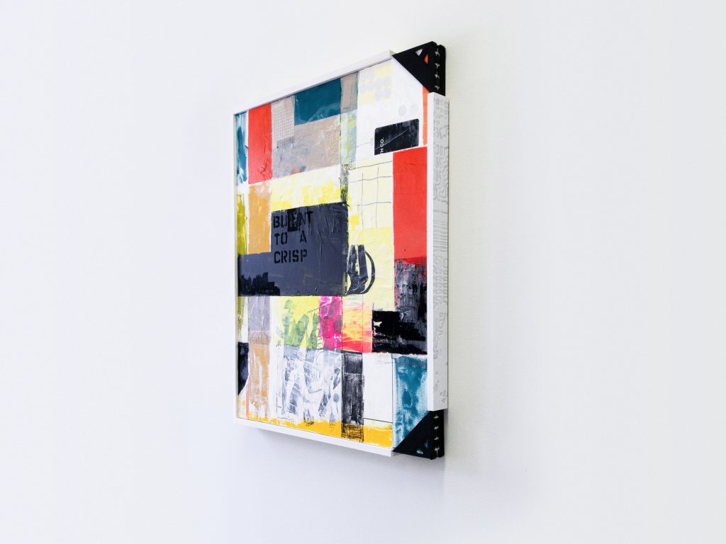
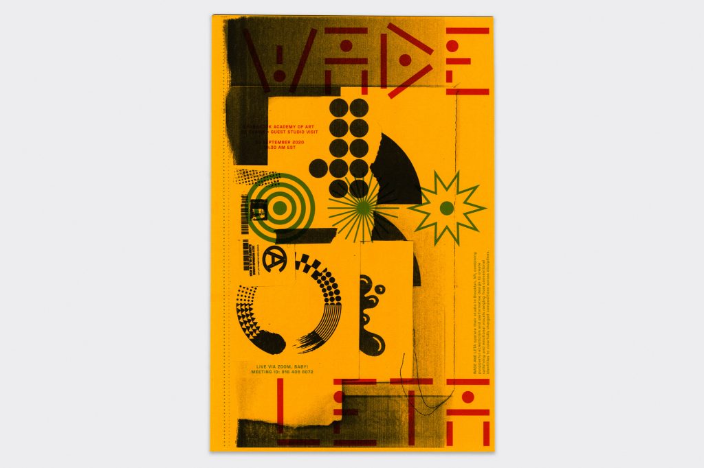
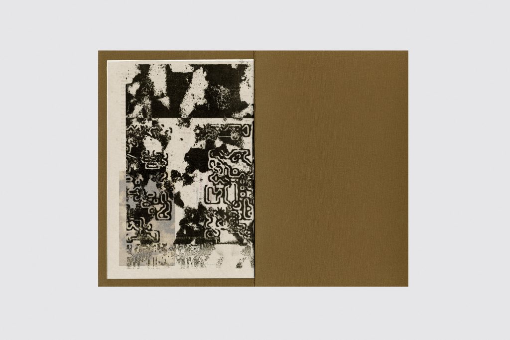
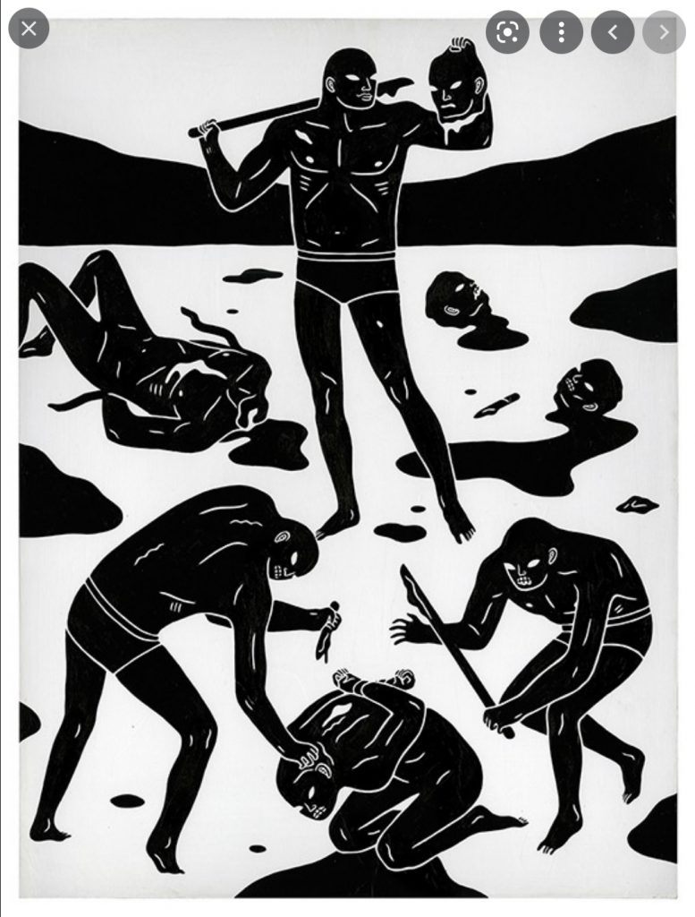
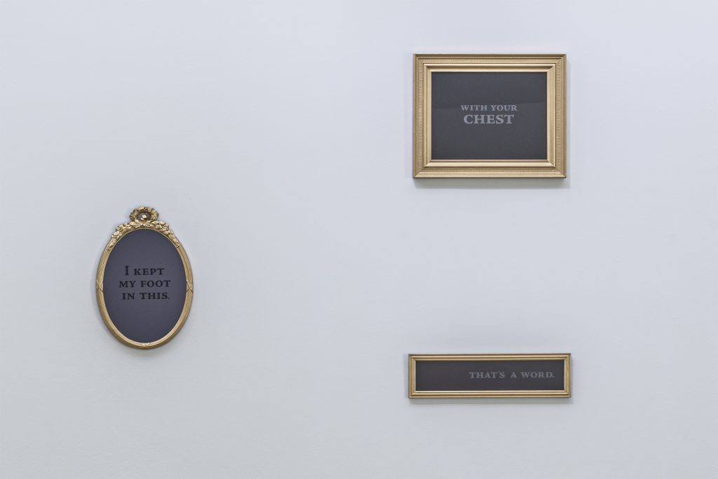
In retrospect, the Visible Language issue was a turning point for the department. Seeking to visually embody post-structuralist theory, the students designed the publication to slowly dismantle its structure as you read through it, beginning with strict grid systems that were deconstructed, page by page. To turn the pages in Visible Language is like watching the transformation of the design department itself, as it came to be associated with graphic design’s “New Wave,” moving away from modernist principles like grids and legibility towards a postmodern design that embraced layering, fragmentation, and illegibility. Students were distorting typefaces, cutting up images, and experimenting with narrative all while catching the eye of the rest of the design industry. David Carson visited to see what the students were doing and even used some of their work in the first issue of Ray Gun magazine, the publication on which he made his name.
This was not simply aesthetic reinvention but also theoretical. “I’m not so much interested in the layers of form as the layers of meaning,” Katherine McCoy said in an interview in another Eye Magazine piece in 1995, commenting on the layered designs the department was now known for. “The first reading is the ostensible first layer of objective meaning. But what is the second? The third?” Students embraced literary theorists like Ferdinand de Sassure, Jacque Derrida, and Roland Barthes and began rethinking what graphic design was and could be. For them, graphic design was not simply for commercial contexts but could be a form of cultural production in and of itself.
For them, graphic design was not simply for commercial contexts but could be a form of cultural production in and of itself.
This design revolution, in many ways, could only have happened at Cranbrook. Its structureless curriculum made space for inquiry and gave freedom to experiment. “This was where the power balance between the personal work versus the professional work started to change,” Blauvelt told me. “The personal work became much more interesting than the professional work.” The McCoys never discouraged this, always open to new ideas and allowing the students to bring in things they were reading and ideas they were thinking about. “This is what made the McCoys so brilliant,” says Elliott Earls, another former student, who has run Cranbrook’s 2D design department since 2000. “I started doing electronic music and performance work in a graphic design program in the early 1990s, and I got a tremendous amount of shit for it. During a critique with Kathy, I said, ‘I’m getting roasted over this and I’m thinking about stopping,’ and she goes ‘Elliott, you have no idea where this kind of work is going to take you.’ And she made a place for it in the department.” Because of this pedagogical framework, Cranbrook helped pioneer the interdisciplinary practice currently popular in design MFA programs, while its students were at the forefront of what we now call the postmodern, or experimental, graphic design of the ’80s and ’90s.
When the McCoys left in 1995, the design department was formally split into two new departments, 2D and 3D Design. Scott and Laurie Makela, former students of the McCoys, were appointed the new 2D Design designers-in-residences and ran the department until Scott died suddenly from a rare infection in 1999. Earls then took over the department and has held the post since. Earls aligned the program with the larger school curriculum, removing projects in favor of a studio practice model. This has allowed students to interpret “2D Design” in any way they please. He’s kept the McCoys’s ethos alive, following the lead of his students. “When you have people that are this smart and this talented in the department and you have the way that Cranbrook is structured, you can’t tell them what to do,” Earls says. “I can’t control them, nor do I want to.” Like the McCoys, Earls’ students have gone on to teach in institutions around the world (I’m not sure I’ve taught at a design school that didn’t have at least one Cranbrook graduate on faculty).

Earls department retains the DNA of early Cranbrook, but he’s pulled the department in new directions in his emphasis on contemporary art and critique. Under Earls’ leadership, the 2D Design department has blurred the lines between graphic design and art, with students working across traditional design, fine art, sculpture, and performance. This is all grounded in rigorous weekly critiques, where students are asked to write about both their own work and the work of their peers. “My desire over the last 20 years has been to make this an intellectual environment that pushes the program forward,” he continues. “So once a week we critique a student’s work for one hour. And we do not get involved in any formalist critique about why something is a certain color or size.”
Over the last half-century, Cranbrook graphic design has been accused of having a “house style” that today’s students are just continuing to produce: layered graphics, distorted typography, and the deconstructivist aesthetics of the ’70s new wave. This is ironic, of course, because the modernist aesthetic they fought against was also a house style. What makes Cranbrook so interesting is that it does not have a house style. In flipping through the pages of With Open Eyes or to look at the work of recent graduates, you’d find a wider range of aesthetics, mediums, and approaches than any other graduate program. Over the history of the program, what emerges is less a clear aesthetic and more a clear approach: students come in, are given studio space, and then told to follow where the work leads. Perhaps in an era when so much of design looks the same, what we need are more design students who are encouraged to catch the next wave. It’s then that graphic design can once again find new aesthetics, discourses, and ways of being in the world that reflect the complexity of this moment. “If design is about life,” the McCoys wrote in the 1993 book Cranbrook Design: The New Discourse, “why shouldn’t it have all the complexity, variety, contradiction, and sublimity of life?”

